When the guidance counselor met with me my senior year in high school to discuss my college plans, I told her that I like to draw pictures and that I wanted to attend Carson-Newman, a little Baptist college.
She was apparently underwhelmed, because she immediately began trying to talk me into finding an appropriate “commercial art” school. Call it a gut reaction or Divine Providence, but the word “commercial” set off all kinds of bells and whistles in my teenage brain, because I was fit and determined to attend Carson-Newman for two main reasons—it was a Baptist college (and I was a Baptist boy) and it had a football team (why should I give up the excitement of college football on Saturday afternoons?).
In retrospect, I now realize that my reaction to my guidance counselor’s suggestion was pretty ironic, because the graphic design that I do these days really does coincide with the “commercial art” that she was pushing way back then. She wasn’t wrong in trying to direct me to a commercial art school—it’s just that she wasn’t totally right, either. That’s because what we learned at Carson-Newman was more than what could have been taught at a conventional school of design.
Whether it was the school’s theology courses and required chapel services, the extracurricular activities or even the lengths that we took to get around the college’s ban on dancing, somehow we learned more about life than how to paint landscapes and specify fonts and Pantone colors. In fact, I really credit my art professor, Dr. Earl Cleveland, with teaching me how to think creatively with nary a mention of a single Pantone color. Throughout my career, I have used the same the same thought process that Dr. Cleveland taught us on my design, advertising and marketing projects, whether it was creating Glock’s first four-color ads (http://www.bridgital.com/NewBridgitalWebsite/ads), or designing and illustrating the 20-foot bas relief sculpture for the University of West Georgia’s football stadium (https://davidrayskinner.wordpress.com/2014/09/10/big-chief-2).
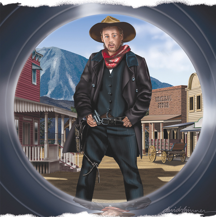
The illustration of the gunfighter (shown above) ties together the old and the new, and the conventional with the digital. It’s called “Last Second,” and I just recently finished putting the final touches on it—using my Mac. My intent (other than to use it with this blog) was to properly update a piece that I initially submitted to Dr. Cleveland back in the spring of 1973. It was the second semester of my junior year and the project was done for a mixed-media course.
Dr. Cleveland had given us a specific (and reasonable) number of completed projects as the requirement needed to pass the course, but at that point in my college career, I was juggling a number of projects and circumstances, and I found myself going down to the wire to complete them. Realizing that I would have to pull an all-nighter to finish them all, I laid out all my paints and brushes and cranked up the stereo. Somewhere in the middle of the Eagles’ “Desperado” album (which had just been released), I put my head down, and a strange concept crawled into my brain. Would it work? It needed to be an airbrush rendition, but I had never attempted any airbrush illustrations.
To my amazement, it all fell into place. Not only was the concept innovative and off-the-beaten path (if not strange and unusual), the colors were bright and inviting. It took me all night to complete the illustration, but I was truly amazed at my ability at handling the airbrush…I had never even seen an airbrush before, much less utilized one! I stood back to admire the finished piece, but something was wrong…it smelled like spit. Was that the way airbrush paints were supposed to smell? What’s more, it was all over my mouth.
I woke up in a pool of drool to the thump-thump-thump of my turntable’s needle bumping over the endgrooves of the Eagles album. There was no painting, there was no airbrush (it would be years before I would actually use one), and there weren’t even any rough sketches. It had only been a dream! However, there was a concept—after all, I had worked on it all night in my sleep.
The idea was one of a gunfighter who was about to die. The look on his face was to be one of puzzled surprise and fear. The reason the viewer would realize that the gunfighter was about to die is that the vantage point of the picture was from the barrel of the gun that belonged to the cowboy who was about to kill him. It was a “you are the bullet” concept, and it was to be a picture created as if there was a tiny little camera in the nose of the .45 bullet that was about to exit the victor’s six-gun and drill its way into the bosom of the surprised gunslinger whose gun had yet to be elevated into position. Oh, those crazy dreams…too much pizza, milkshakes, and Eagles.
Obviously, using an airbrush was totally out of the question. So, I created the piece as a pen, pencil and watercolor black-and-white painting. So much for the vibrant colors. Through the years, I have always felt like it was an execution (so to speak) that didn’t live up to the concept.
But now, here we are, living and working in the digital age. This time around (43 years later), I used a mouse and Adobe Illustrator and then dropped the layers into Adobe Photoshop to refine and “airbrush” all the details. Plus, once again I listened to the Eagles’ “Desperado,” only now, I have it stored in Mac’s iTunes, along with the rest of their albums.
Sadly, and coincidentally, it was while putting the final touches on the illustration that I heard about the death of Eagles co-founder Glenn Frey. That only underscored the poignancy (and my perceived importance) of reproducing the artwork. I have to say that I find it interesting and ironic of how fast technology is advancing; it seems to be moving at the same rate of speed at which some of us are winding down.

David, you are a painter par excellence. This is one of the best things I’ve ever seen of yours, and that’s saying a lot.
Very interesting. We await the Owen Bee saga and how your editorship figured into your graduation from college.
Thanks, Becky…it’s amazing how much my Mac helps me draw!
Great job David! I like the clean, bold composition. I assume it’s you as the gunslinger?
Actually, I’m the horse…but he’s covered up by the gunslinger!
Love the story, David! Didn’t see the Glenn Frey coming, Big Bang to the story! The reflection on the barrel, rings my bell! Great work!!
Shelby, Glen Frey’s death was yet another wake up call for me and many of our generation. I believe the sadness that goes along with an event like that is rooted in the realization that we’re just renting space here on earth, and anything that we do should be viewed through the filter of eternal ramifications. I just remember the thrill of that album and how it served as a soundtrack for those emotional days back then, some of which were spent at your house in Florida with you and your parents…